Todd Astroth
User Experience
My passion for user-centered design grew while working in quality assurance. I have had the opportunity to work with a variety of stakeholders including Customer Support. Since that time, I have learned just how vast the field of user-centered design really is and all of the tools and methodologies available. From user research, to information architecture, to prototyping, to usability testing, there is a lot of consideration that can go into a design before even beginning to develop the product.
Below details my experience with User Experience projects, followed by my Top Ten UX Tips.
Redesigning Kmart.com
- information architecture
- wireframing
- redesign
- e-commerce

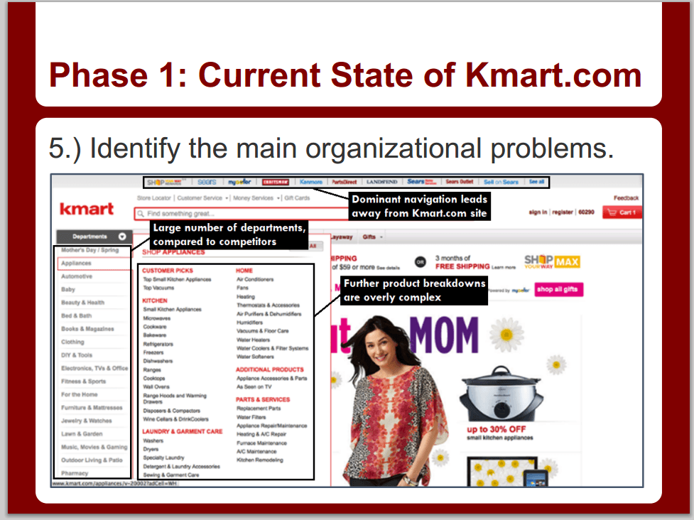
Often times, e-commerce sites can become overly complex, and it can become exceedingly difficult to locate what you need on the site. A discouraged user is a lost customer. For a team project in one of my classes at DePaul University, my team decided to redesign the e-commerce aspects of Kmart.com.
As part of Team Matokijo, we worked together to define the current state of the Kmart.com site (as of April 2013) and identify issues regarding site structure and product organization. After gathering input from users, the team used design principles and other information architecture concepts to redesign a simplified site structure and new page wireframes.
Evaluating a Travel Website
- evaluation
- heuristics
- wireframing
- usability testing

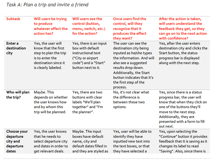
"Flights With Friends" was a travel website that allowed friends to collaborate online to plan trips. Friends could also reserve flights, hotels, and rental cars.
As an ongoing class-long project, my team performed various forms of evaulation on this website, locating areas of improvement. We first performed a heuristic evaluation and contextual inquiry. We then tested our recommendations by performing usability testing with mockups of the actual site versus our recommendations.
Road Hazard Reporting App
- mobile apps
- information architecture
- prototyping

As an avid "road geek," I encouraged my Capstone group to design an app for citizens to report road hazards and incidents. We realized that there did not exist any app for reporting hazards which can automatically send reports to the appropriate government officials.
We conducted research of existing apps, read user reviews, conducted a card sort of various possible hazard requests, and then designed a usable prototype. I loved working on this project, and I hope some day a similar app or reporting system can be implemented.
Chicago City Services App
- mobile apps
- iOS
- Android
- wireframing

The "City of Chicago" website offers numerous tools and services to citizens - everything from paying a water bill to reporting a pothole.
For a class assignment, I designed wireframes for a mobile app that would accomplish these services without the extra clutter of the desktop site. I designed wireframes for two sample scenarios that demonstrate the capabilities of the app. I started by designing for iOS, and then designed equivalent screens for Android.
UX Interactive Lesson
- instructional design
- e-lesson
- prototyping

For my "Learner-Centered Design" class, I designed an interactive lesson which teaches the learner about UX concepts. There is a massive amount of detail that goes into UX, but I felt I could easily introduce someone to the basics via this lesson.
Designed in Axure, the lesson follows a simple pattern of explanation of concepts followed by simple multiple choice questions. I designed the lesson to minimize clutter and ease the user into the subject matter.
Todd's Top Ten UX Tips
Limit the use of icon-only buttons, unless you are low on space. There is not a perfect icon for every situation.
Do not fall victim to the infamous "Feature Creep!" Focus on supporting the most solid project features. This keeps the application from becoming a huge jungle of content.
Limit flyout submenus to one level only. Adding more submenus requires pinpoint mouse precision on the user's part.
A 2-column web layout suffices in most cases. 3-column layouts often result in a cluttered look which results in the user skipping much of the content anyway.
Is the customer "always right?" Sort of. The customer knows what they want to accomplish, but they are not always aware of the best methods to accomplish the task.
Keep it consistent! Humans are habitual creatures, so keeping things consistent will cut down on the time to re-learn an interface.
We UX Specialists do not have all the answers. Think of us as mediators that seek out the best solution that will suffice for both users and stakeholders alike.
Just like coding, avoid a "Spaghetti Site Map". A more maze-like site will not only confuse customers but your development team as well.
Remember to put yourself in the user's shoes. Often times, development teams think in more advanced technical terms, which results in an often over-advanced interface.
Limit the use of popups, ads, or intro videos on websites. These often just serve as roadblocks that tend to annoy busy customers.